Data Visuals
This page presents key data visualizations that illustrate how misinformation spreads, how audiences become vulnerable, and how platform algorithms amplify fringe influencers. While the visuals themselves appear as placeholders here, each section explains what the data represents and how it connects to the findings in the research paper.
1. Emotional Content vs. Factual Content Spread
Description:
Research shows that emotionally charged misinformation spreads significantly faster and farther than factual information. Studies in misinformation behavior (such as Kaur & Gupta, 2023) consistently demonstrate that content evoking anger, fear, or outrage generates more engagement than neutral or evidence-based posts.
What the visual should show:
- A line graph comparing the spread rate of emotional misinformation versus factual posts over time.
- Emotional misinformation will show steep spikes in shares, comments, and engagement.
- Factual content will show flatter, slower growth.
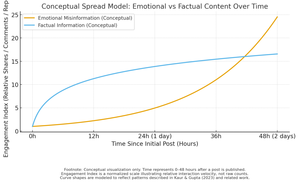
How it supports the research:
This pattern helps explain why influencers rely on dramatic storytelling and emotional messaging. Algorithms reward posts with high engagement, making emotional misinformation more visible to users.
2. Cross-Platform Migration Diagram
Description:
Misinformation often begins on fringe platforms before moving into mainstream social media. This cross-platform flow allows fringe narratives to become normalized and widely circulated.
What the visual should show:
- A pipeline diagram showing movement from platforms like 4chan → Reddit → TikTok → YouTube → Instagram → Facebook.
- Each arrow represents how content evolves visually and emotionally.

How it supports the research:
This demonstrates the “fringe-to-mainstream” pipeline described in Kaur & Gupta (2023) and seen in real misinformation campaigns.
3. Algorithmic Amplification Heatmap
Description:
An algorithmic heatmap helps demonstrate how digital platforms prioritize and promote content based on engagement metrics. Platforms reward content that keeps users scrolling, regardless of accuracy.
What the visual should show:
- A heatmap or bar chart highlighting which content categories receive the highest visibility.
- Categories may include emotional posts, political commentary, memes, and conspiracy content.
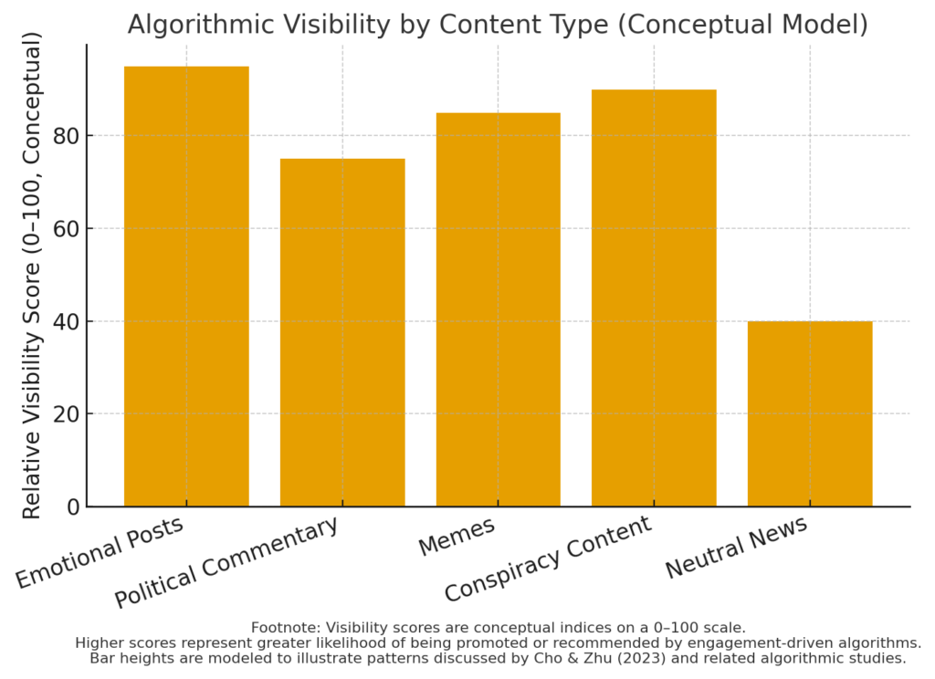
How it supports the research:
The data visually reinforces Cho and Zhu’s (2023) explanation that content dissemination depends on visibility mechanisms optimized for engagement, not truth.
4. Influencer Network Influence Map
Description:
This graphic should visualize how political influencers cluster and amplify each other’s content. Influence maps show how small groups of accounts disproportionately shape online narratives.
What the visual should show:
- A network graph with nodes representing influencers.
- Larger nodes represent high engagement and follower count.
- Connecting lines show retweeting, dueting, stitching, or resharing patterns.
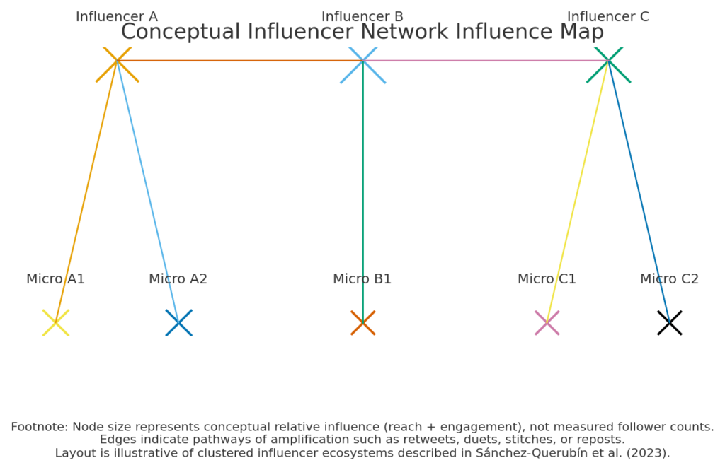
How it supports the research:
These clusters reflect the dynamics described in Sánchez-Querubín et al. (2023), where small but active groups push political content into high-visibility spaces.
5. TikTok Aesthetic Messaging Examples Chart
Description:
A comparison chart illustrating how political messaging changes when adapted to short-form video formats.
What the visual should show:
Columns comparing:
- Original Message (text-based political argument)
- TikTok Version (memes, audio, filters, humor)
- Engagement Metrics (likes, comments, shares)
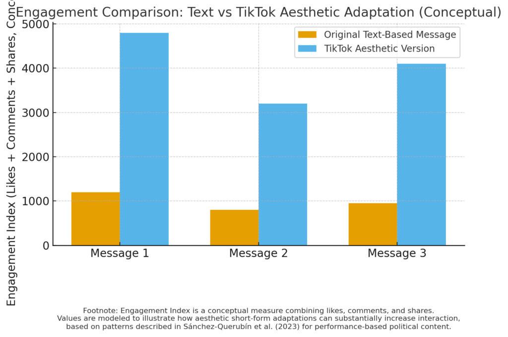
How it supports the research:
This shows how aesthetics transform political rhetoric into easily shareable content that often bypasses critical thinking.
6. Health Misinformation vs. Verified Guidance Comparison
Description:
This visual highlights how misinformation spreads more widely than official health guidance during crises such as COVID-19.
What the visual should show:
- A side-by-side bar chart showing reach of misinformation posts vs. verified health posts.
- Include metrics such as impressions, shares, and engagement rates.
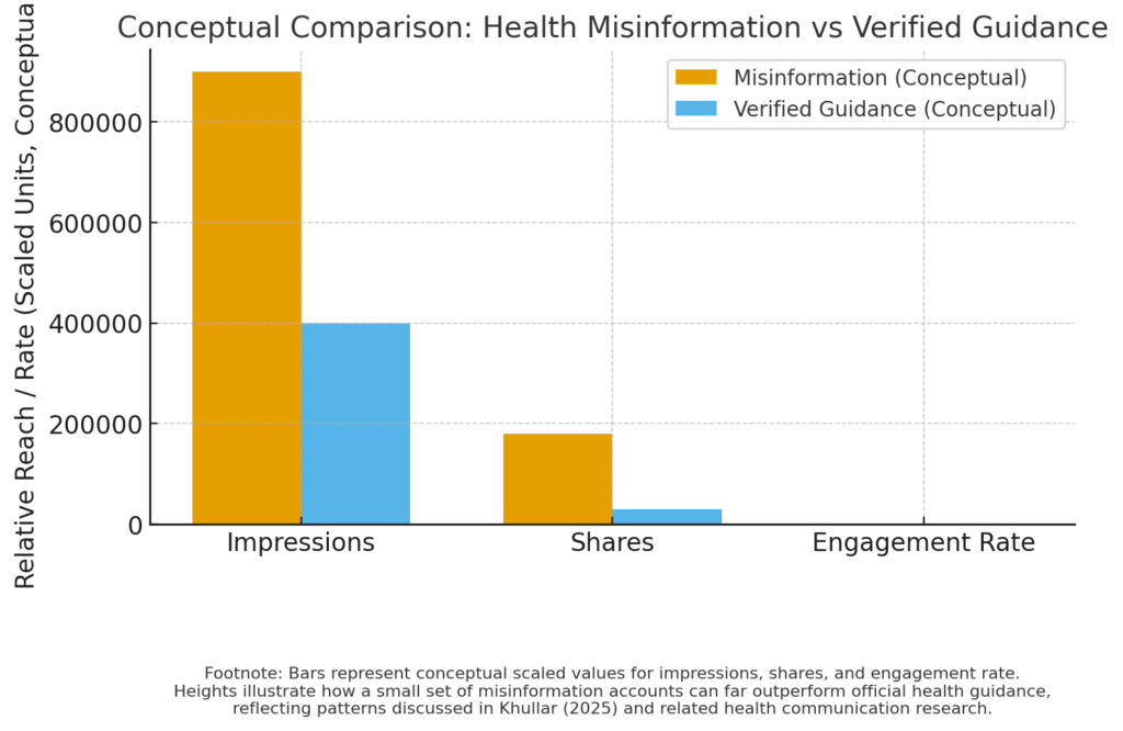
How it supports the research:
Khullar (2025) notes that a small cluster of accounts (“the disinformation dozen”) produced the majority of vaccine-related misinformation, which this visual helps illustrate.
7. User Critical Thinking Intervention Outcomes
Description:
This visual supports findings from Ku et al. (2026), showing the impact of “boost and nudge” interventions.
What the visual should show:
- Pre-intervention vs. post-intervention accuracy scores
- Reduced sharing of misinformation
- Improved analytical reasoning metrics
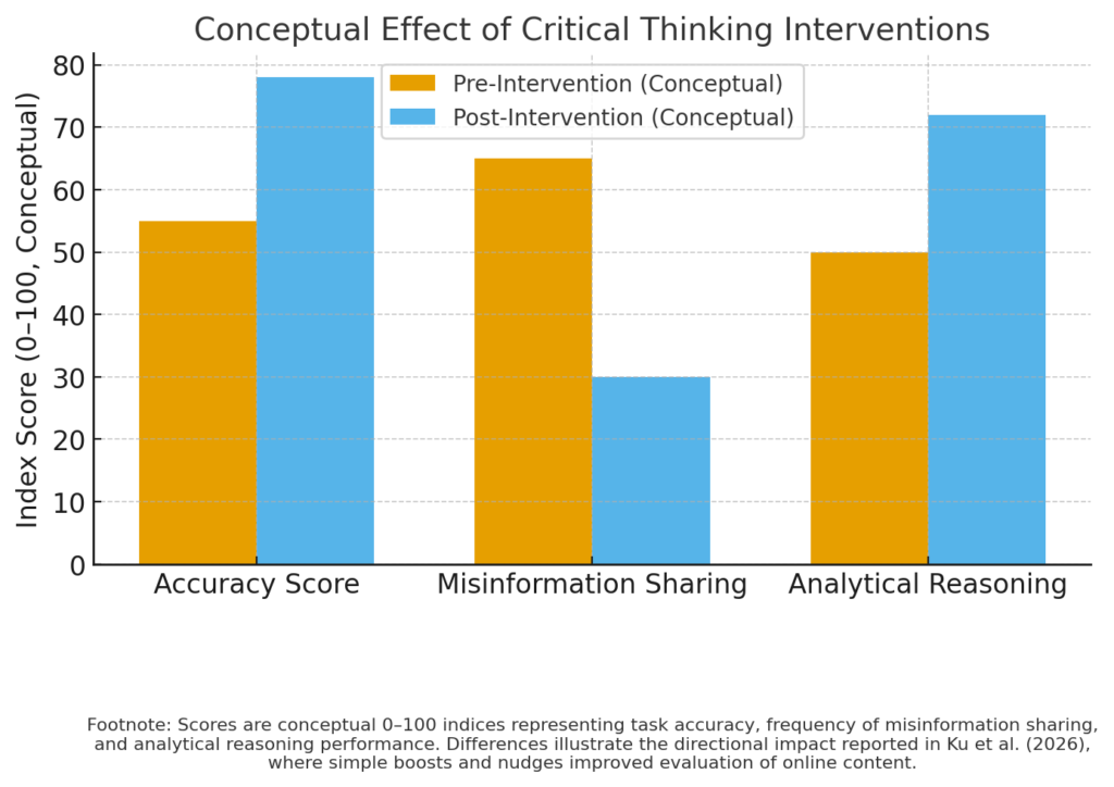
How it supports the research:
It demonstrates that simple interventions significantly improve users’ ability to identify misinformation and make more informed choices.
Conclusion
The visual data on this page illustrates the underlying mechanisms that enable influencers and activists to manipulate public opinion across digital platforms. Whether through emotional amplification, cross-platform movement, influencer network clustering, or algorithm design, the patterns shown in these visuals help explain why misinformation spreads so quickly and why audiences are often vulnerable to persuasive but inaccurate content.
These data visuals complement the written research and case studies by showing how complex digital influence systems function beneath the surface of everyday social media use.